


Inline components can be inserted within existing pages, unlike overlay components which are added on top of a page, such as a popup or sidebox.
How to set up an inline component
First step is to choose a component. Via the Components tab, you can view the complete library of components that are ready out of the box. You can use the filters to view all inline components at once or also filter by categories such as onboarding, activation, forms, and more depending on your needs.
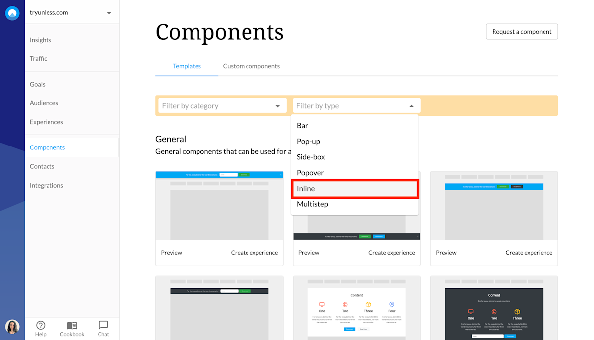
You can preview the different components before choosing the one you want to use. Once you've made your choice, click Create to get started.

Inline component settings
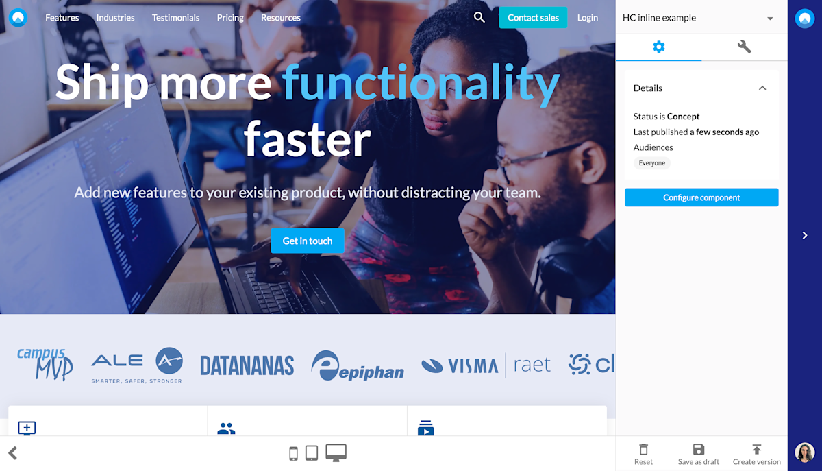
This will take you to the Settings tab. You might notice that the settings for a component are very similar to on-site experiences. You give your component a name, define the page(s) it should appear as part of as well as the audience(s) that should see it.
After adjusting the settings, first click Save and then click Open editor. Once you are in the editor, as in the example below, you can click Configure component.
Inline component design
First, you have to define where you want the component inserted. You can do this via the Inline tab. You have to select the radar icon (marked on the screenshot below) and then click on an element on the page. While you are hovering with the mouse, a red rectangle will appear around elements, showing you what would be selected when you click.
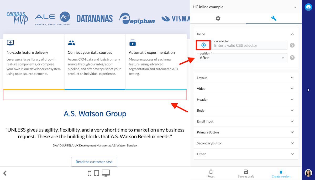
Once you make a selection, the component will appear after that element. However, you can also specify whether you want your component to appear before or after that element, or to replace it. If you change this setting, the component will automatically readjust.

After this is done, you can start configuring your inline component to make it fit your particular use case. You can change the headline, text, image(s) along with their placement, fonts, colors, etc.
Lastly, establish whether there should be an email collector and if you want to have a CTA button or two, what the buttons should say and where they should take a visitor to and so on. If you need further customization, you can also use the Other section to add custom CSS and Javascript and to switch on Expert mode.

Once you've made all the changes you need and your inline component is ready, make sure to save, create new version and publish before exiting the editor. Then click start experience at the Settings tab for this component which we've seen earlier.
Ps. If you haven't already defined your themes to match your company branding, you can do that via the Themes tab under account settings. This is something you (or a designer from the team) has to do once and then your theme(s) can be applied to all your components.